Wednesday, 22 January 2014

Ideas of Articles to Feature on the Front Cover

Below is a list of ideas of articles to advertise on my front cover. From my article research so far I would really like my main double page spread to be about the no makeup selfie campaign for cancer research. The other ideas I have just come up with I believe would be eye catching and relatable for my target audience. The ideas with numbers included in the title are there because on the other front cover magazine I have looked at, articles with numbers involved have been advertised.

·         No Makeup Selfie – the cancer research campaign taking the women of Britain by storm.
·         30 hair styles you can try at home.
·         The best clothes to compliment your body shape.
·         3 steps to a clearer complexion.
·         How to make the best out of a bad situation – we hear your inspiring stories.
·         What does your hair colour say about you?
·         20 ways to clear a busy mind.
·         Why we love Katie Piper.
·         Simple easy ways to get the motivation you desire.
·         Is your body getting the vitamins it needs?

Tuesday, 21 January 2014

Readers Eye Direction

Readers concentrate on the top parts of the double page spread. This is the first place where their eye will stop when they skim through the pages, so you cannot start your story by placing headline on bottom right page. This is not natural starting point. It is not good design if the reader has to search through the page to find most important thing (if there is no image on the page), and that’s the headline. It is even worse if you put the headline at the bottom and you put beginning of the story on top of it.

This is not a natural way of reading the story. Everything should have flow. You should work your way from the meaningful top left and then continue to the bottom. Headline, introduction and then the main article.

Front Cover Font Colour

The colour of font for my front cover will be black. I think that this is the best colour option to choose because the title is black and will create a colour scheme continuity throughout my front cover. Black will also stand out against the pale and light colours of my background making the writing clear and easy to read. However part of my background, especially where the models hair is, is a little darker so I will look into using a light colour in these parts. This will hopefully consequently give my front cover the professional look I am aiming to achieve.

Front Cover Background and Title

 
This is the basis of my front cover, the title and the magazine. I have taken this from my billboard as that it what I am using as the basis of my front cover to create a sense of continuity for my target audience. I have followed the conventions of a front cover of a magazine by having the model as the main feature in the centre taking up the majority of the page, and the title in bold letters at the top of the page so that it is easily identified.

Photo Shots for a Double Page Spread

Photos for double page spreads can be taken in a range of ways including:

·            Mid shot
·            Close up
·            Long shot
·            Point of view
·            Establishing shot
·            Extreme close up
 
I plan to take my photos in a range of different shot angles; I plan to do this to give me a variety to enable me to choose the most suitable pictures for my magazine. My billboard consists of a mid-shot, so where you can see the models face and shoulders, this is going to be the basis of my front cover, and I intend to use similar shots for my double page spread, but also with more of a variety of shots.

Monday, 20 January 2014

Template for my Front Cover


Planning my Front Cover

Following my research I have decided to use my billboard as my basis for the front cover of my magazine, I am doing this so that my magazine is instantly recognisable to my target audience following the advertisement from my billboard.

I will use the layout with the same model and title format and add text about the article in my magazine situated around the models face, this follows the normal conventions of a front cover for a magazine. Therefore my front cover will look very similar to my billboard making it recognisable for my target audience.
I will most likely use black colour font as that is what colour the title of my magazine will be in, this is because the black will stand out and be readable against the pale background consisting of the pastel blue colour of the models jumper and the white canvas she is standing in front of.

Vogue Magazine Double Page Spread Analysis


Above is an analysis I have conducted of Vogue magazine double page spread. By doing this I am able to see what other magazines of the genre I am following have done to ensure my double page spread reaches its best potential.
Survivor, the title of the article is written at the top in large bold capital letters which makes it instantly eye catching to the readers, underneath is an insight as to what the article is about, this needs to be interesting as the readers will read this first and it will determine their minds as to whether they will continue reading the article or not, this is written in italic and it stands out against the other normal font, overall giving it a vintage feel.

The large letter “I” marks the beginning of the article again giving it a vintage feel. The text is separated through two columns with the same continual font throughout giving it a vintage feel yet again.

On the opposite page the model covers the entire page, which gives the impression that this is the main article of the magazine, showing importance and emphasis on the model. The models outfit compliments the vintage feel of the article and compliments the duck egg blue background, with the white on the opposite page, the red shoes add a pop of colour to the article and finish off the vintage theme of the double page spread.

I like the way that this article is set out, with the vintage theme and the use of colours, especially the way that the brief insight is separate and in italics.

Codes and Conventions of a Double Page Spread

Codes and conventions that are included in a magazine are created to insure that there is a formality between issues, I will use the codes and conventions so that my magazine and a real style magazine will have similar features therefore if I were not to use a formality readers would not be able to identify my style of magazine.

Code and convention rules for a double page spread include the magazines generally being written in columns, this is normally done to break up the reading so that the reader is not reading across a page but reading down in small blocks to create more of a variety compared to normal reading articles and books. The conventions of a title are that it is big and bold and stands out from the rest, it is often located in the top left hand corner or in the center of the page. The title is to let the readers know what something it is, sometimes giving them a sort of indication of what is going to be on the inside.

Sunday, 19 January 2014

What I Have Found Out Through My Front Cover Research

Through my front cover research I have found out that the model on the front cover of my magazine is best located in the centre of the page with the writing situated around it, therefore the attention is focused on the model on the cover. Also the title of my magazine should be located at the top in the middle therefore following the usual conventions of the front cover layout.

After analysing different front covers of the same genre I am following I believe that my front cover should not be over crowded with information and that only relevant catchy information about my articles should be presented. Therefore my audience will be aware of what is inside without being over crowded with information at the first glance.
The colours used in my front cover should complement each other and should not clash, otherwise the magazine will look unprofessional and put my target audience off from reading it. To see what colours compliment I should refer to my colour wheel. The colours used should also be readable against the background of my front cover.
Now I am ready to start planning my own front cover for my regional magazine.

Saturday, 18 January 2014

Adele vs. Karl Lagerfeld

In early 2012 Adele was labelled as “fat” by Karl Lagerfeld, Adele simply responded by saying: “I’ve never wanted to look like models on the cover of magazines…I represent the majority of women and I’m very proud of that.”

She went on to say: “I’ve never seen magazine covers or music videos and been like ‘I need to look like that to be a success,’” the talented Brit explained. “I don’t want to be some skinny mini with my tits out. I really don’t want to do it and I don’t want people confusing what it is that I’m about.”

In a world where anorexic runway models are applauded and women feel insane pressure to look like Hollywood stars, it’s refreshing for someone as talented and successful as Adele to embrace herself. Not only is she secure with who she is and how she looks, she has no desire to drop 20 pounds or suffer through a diet. She’s content with what she brings to the table and that is exactly the message I intend for my magazine to portray to teenage girls.
 
Adele 1 - Karl Lagerfeld 0

Katie Piper


In 2008 Katie Piper was the victim of an acid attack which was arranged by her ex-boyfriend and carried out by an accomplice. The attack left Katie blind in one eye and her face was scarred. Prior to the attack Katie had a full time career in the media as a model and television presenter.
 
After the attack Katie left the limelight out of fear of what others might think and say to her appearance, however in 2009 Katie decided to take the brave step back into the limelight to increase awareness for burn victims. Her Chanel 4 documentary Katie: My Beautiful Face was first aired in October 2009; it has subsequently been repeated on several occasions, made available for online on-demand access and sold internationally.
More recently, Katie has appeared in follow-up series for Channel 4, released a best-selling autobiography, and had a regular column in weekly magazines; however, she primarily works for her charitable organisation the Katie Piper Foundation.
Katie’s bravery has managed to give back the loss of confidence to many other burn victims, Katie is not afraid nor embarrassed of her appearance and has taken the tragedy to what happened to her in her stride and helped others regain the confidence and self-esteem lost to them through burn scars.
The confidence that Katie has given to others through her own story is very inspiring and fits with the basis of my magazine about restoring confidence lost in young girls and letting them know that they should not be ashamed of who they are or what they look like.

Elle Magazine Front Cover Analysis

 
Above is an analysis I have conducted of Elle magazine front cover. By doing this I am able to see what other magazines of the genre I am following have done, to ensure my front cover reaches its best potential.
The front cover follows the usual conventions with the model being the main focus point in the middle of the page, however what makes it different to other magazine front covers that I have looked at is that the title situated conventionally at the top is not in bright bold colours like the others, instead it is simple and almost transparent with aspects of the model coming through and it is also separated between the two L’s to allow more attention on the model, however this fits completely with the nude colour scheme and stands out against the darker background.
What else is different about this magazine to other magazines front covers I have analysed is that the page is not over crowded with writing, such as the Company magazine front cover that was very crowded, I believe that this front cover is much more effective in grabbing the target audience’s attention as it does not look tacky but instead classy with more attention paid to specific advertised articles; the colour scheme also complements this idea of class as it is not bold and in your face but instead subtle and easy on the eye.
I really like how this front cover has taken the less is more approach, I think it is really effective with the overall layout of the magazine complementing the colour scheme.

Relationships Between Magazines and their Readers

A way for magazines to  engage with their readers is to create a relationship with them. The way a magazine addresses the reader is an important indicator of how the magazine sees the relationship between it and the reader. If you think about it this is really a one way relationship. The magazine sets the language and tone of how it communicates with the reader. This can be very difficult to get right.

There are usually many references to we – they are saying: you reader and me the magazine are in this together whether it is weight loss or how to deal with a difficult boyfriend. We will help you, be a friend to you and especially for teenage migraines we will certainly not be a parent or teacher. We are your wise friend, and even if we do not know all the answers, we can steer you in the right direction. Some parents feel the advice on offer in some teen magazines is distinctly not right.

Therefore I am for my magazine to reach out to teenagers, with the message that the best you can be is simply being yourself, teenagers shouldn’t feel pressured into feeling and acting a certain way by the way they are reached out to and portrayed in the media, they should be encouraged to not be afraid to express who they are, no matter what shape, colour, religion, or size.

Friday, 17 January 2014

No Makeup Selfie

As part of the latest campaign for raising money ad awareness for cancer research women of all ages have been taking a photograph of themselves with no makeup on and posting it on the internet with the plea to donate some money to cancer research uk.

This campaign has taken the women of the UK by storm and has even ventured out into the world of celebrities, with stars such as Millie mackintosh and holly Willoughby taking part in the attempt to raise some money.

The trend started on the social networking site Facebook and quickly moved on to twitter, the person then having posted the photo would then nominate others to do the same. This campaign has attracted so much attention it has been appearing on the news and in newspapers. The campaign has so far been a complete success raising over £2million.

By doing an article on this for my magazine would be perfect as it shows so many people being brave enough to show off their natural beauty in aid of such an amazing cause therefore hopefully giving my target audience an extra boost in confidence also.

Imitations

There have been many legal cases brought by publishers accusing each other of copying designs. The main scenario is that one title is trying to imitate another. Among them there have been:

·         Hello! Magazine warning OK! Magazine not to copy its look
·         Red and Real clashed over their title designs, with the latter giving way and redesigning its masthead.

However, many magazine titles do imitate another’s design or same and some sectors, such as the celebrity weekly’s and home magazines end up with a similar look as to what is popular at the time.

Although I have been researching other fashion and beauty magazines, mine is aimed to be completely different from the rest that are out there.

Thursday, 16 January 2014

Magazine Colour Schemes

The overall look of a magazine should be consistent throughout all pages. Less is better. Colours that complement each other should be used otherwise the magazine would look tacky and no one would want to read it. There is a simple way of doing this by looking at a colour wheel.


As you can see from the image above, certain colours will look better together.


The colours of the magazine above The starting point was the blue sky. Now look at the colour wheel and find the blue. Directly opposite the blue is the colour which best compliments it, Orange. If you use the colour in the images on the page your magazine will flow better. Always pick the complimenting colour and use it throughout the design, for example, headlines, colour grab boxes, and boarders.

The colour choosing colours for my magazine I think I will use pastel colours, they are minimalistic, classy, and easy to blend in together, also as they are fashionable at the moment I believe it will gather more attention and be more appreciated from my target audience.

Lena Dunham

Lena Dunham is a very famous actress in America and is most known by an audience for her sitcom, Girls. The sitcom is watched by an audience of girls around the ages of 16-30. Therefore a large proportion of her viewing audience is teenage girls. So when Dunham was due to appear as the front cover of Vogue magazine it was to marks a huge landmark in her career.


However, recently the images have been leaked much to many peoples dismay and it is clear that the images have clearly been photo shopped. This is not that much of a surprise to the general public, except that they have been so vastly edited to the extent that her left arm is missing in one of the images of her laying across a bed. Also the cover shot is not of her entire body just of her portrait which is common when high end magazines so not to show an entire body.


Lena Dunham is a woman that society would class as a larger woman, therefore for her to be on the front cover of vogue, it is a big deal in the movement of fashion and beauty magazines using images of larger models. Consequently by her doing this it would give many of her fans of a larger size a boost in confidence and self-esteem. However with the photograph being so heavily photo shopped, it completely contradicts the idea of this.
 
This reinforces my idea that the photographs will not be photo shopped in my magazine to the extent of changing the models appearance, therefore this will not give the audience an unrealistic image that they believe is what society thinks is ideal, instead I will only enhance the colour to give my images a more professional feel and allow girls that boost in self-esteem they need by presenting them with realistic and not digitally enhanced model that they believe that is what society expects them to look like.

Typography

When you have a lot of text, as you usually do in a magazine, typography can make a huge difference between a boring article and one the target audience would like to read. Hierarchy is one of the important concepts, what is important is always larger and maybe with another colour, which has a higher contrast with the background so it is more visible. If a front cover is organized properly, then the titles will always stand out and the most important information will be easy to find.

Therefore with my magazine will be limited to the text that is important, therefore it will not be overcrowded and the relevant information per article summary will be together and organised, otherwise it will confuse the target audience and put them off from reading it

Wednesday, 15 January 2014

Company Magazine Front Cover Analysis


Above is an analysis I have conducted of Company magazine front cover. By doing this I am able to see what other magazines of the genre I am following have done to ensure my front cover reaches its best potential.

The front cover follows the usual conventions of any magazine cover, with the model as the main focus point and the writing situated around it, because the brand Company is well known the models head is covering part of the letters, this means that the magazine is still instantly recognisable.
The colour scheme if the front cover is different shades of purple, therefore they have used white writing for the text. White writing is not normally used unless of very dark backgrounds, however with this one being not too dark the white was unexpected, however if they were to have used a darker font then the overall look of the magazine would have been a lot darker, using the white font brightens and lightens up the front cover making it a little unusual and edgy.
The font is not continual throughout the front cover, it is of different types and sizes. The usual conventions are that the font is usually the same throughout so this goes against that, although it looks confusing at first and very over crowded, this gives the front cover a more unusual eye catching look.
For my front cover I think I will make sure that my font is all the same, as at first this front cover did look a little over crowded and confusing and would put me off from reading it, I do not want my target audience to feel the same way about mine.

Vogue Magazine Front Cover Analysis


Above is an analysis I have conducted of Vogue magazine front cover. By doing this I am able to see what other magazines of the genre I am following have done to ensure my front cover reaches its best potential.
The front cover follows the usual conventions of any magazine cover, with the model as the main focus point and the writing situated around it, because the brand Vogue is well known the models head is covering part of the letters, this means that the magazine is still instantly recognisable.
The font is the same throughout the front cover creating the idea of the magazine cover flowing and gives it a touch of elegance. The font colour, red and black, is also continual throughout creating the same effect. The colour scheme contrasts against the light blue background making it readable and clear, with whatever is in red, like the title and part of the main article, to stand out the most drawing in the target audience’s attention.

The way that this title page is set out is the same way I will set mine out, with my billboard being in the form of a front cover page, I will use the same image and title to create continuity for my target audience so that it is instantly recognisable.

What a Front Cover should consist of

Below is a list of what a typical magazine front cover should consist of, by using this list I will ensure that my magazine cover fits the right criteria and consists of what is required to draw in my target audience’s attention.
·         Plugs – information about the contents of the magazine to get the audience’s attention
·         Cover Lines – information about the articles features in the magazine
·         Puffs – a word of phrase that is used to boost the status and engage the audience
·         Masthead – the logo or design of the company that issue the magazine
·         Main cover line
·         Price
·         Issue number
·         Feature article photographs
·         Barcodes
·         Type Face- the type of writing style to which the magazine company uses
By using this criteria my front cover should reach the best of its ability in securing the attention of my target audience.

Tuesday, 14 January 2014

Standard Of Beauty & Photoshop - Model Before and After


The video above is a very clear presentation of the lengths magazines go to, to present the ideal “beautiful woman”. This video shows the before and after shots of the model, who by the end is barely unrecognisable. The model before was beautiful, however teenage girls are unlikely to see the before shot in a magazine, they then believe that the final shot after the editing, is what they believe to be beautiful hence, what society expects of them.

Monday, 13 January 2014

Bear Faced Campaign

The bear faced campaign is a campaign run by BBC children in need. The idea of the campaign is for celebrities to be photographs with no make-up on and a paw print on the face. The campaign was a massive success and raised lots of money for the charity.

The campaign caught such attention that is featured in vogue magazine, featuring model Suki Waterhouse. Suki being a model went against model conventions of being photographed with no make-up on, by vogue featuring this article it doesn't fit their ethos as they regularly show images of beautiful, very highly made up women in expensive clothes, going against their house style.

My magazine however an article such as this would fit my house style and is something my target audience could relate to. Article such as this shows women that even celebrities have flaws and reinforce my argument that nobody is perfect, everyone is different and that confidence is key.          

The "Thin Ideal"


The “thin ideal” being portrayed in the media is a constant reminder of the negative body image being taught to adolescents in our culture and then continuing to be supported by the rest of our population. Media access is at its prime, with a click of a mouse any and all information is accessible. The amount of diet and exercise articles in magazines has been increasing with every new year. The BMI of the cover models has been decreasing every year. If we do not take drastic measures to stop this trend, more and more cases of eating disorders are going to spring up.
Body image and self-esteem are definitely affected by the media especially magazines, in that people compare their actual physical body to those in the media and experience guilt or shame and thus body dissatisfaction. Not only should the health of the viewers be of concern, but the health of the models who are themselves at risk for eating disorders should be taken into consideration.
Perhaps more studies should be done on the effects of the increasing “thin ideal” on the models used to portray it. The long term effects of the media should be researched more thoroughly, and perhaps examine the body image and self-esteem of the generation in which the “thin ideal” began. If we cannot come together as a society and change the way we perceive beauty, there will be serious health consequences, not only in the physical sense but also the mental sense.

The main problem is that a lot of young and vulnerable teenage girls do not understand that these images are not healthy, and are most likely photo shopped. Young girls need to be inspired and be made aware of the dangers behind the types of images, and what they are doing to their physical  and mental health. My magazine will hopefully do this. Through presenting images of models of a healthy size, and giving the impression that they are comfortable with who they are, teenagers will get the message that you don't have to be thin to be beautiful.

Sunday, 12 January 2014

The Statistics of Models with Eating Disorders

 
  1. The majority of runway models meet the Body Mass Index otherwise known as BMI, criteria to be considered anorexic
  2. Vogue magazine stated that they chose Gisele Bunchen as their “model of the year) due to the fact that she deviates from the typical “rail thin” image. In fact, Gisele weighs only 115lbs and is 5’11-25% below her ideal weight
  3. At 5’7 and 95lbs, Kate Moss is 30% below the ideal weight for her proportion
  4. Fashion model’s weight averages only 8% less than the average woman 20 years ago however today the average fashion model weighs 23% less than the average woman
  5. 25% of American Playboy centrefold models meet the criteria to be considered anorexic
  6. Many magazines create images of women that don’t really exist by using computer-modified  compilations of various body parts
  7. Mannequins closely resembled shape of the average woman in the 1950’s; the average mannequin and woman both had the hip measurement of 34 inches, however since then there has been an increasing disparity between mannequins and the average woman. By 1990 the average hip measurement of a woman had increased to 37 inches, whilst mannequins have decreased to 31 inches.


Models and Eating Disorders

Models on the catwalk and in magazines are usually of an unhealthy weight, causing the consumers to believe that they have to look a certain way to feel accepted and classed as beautiful by society. Hence, the idea of looking this way takes over their way of thinking and attitudes towards food and exercise, and then if they believe they have not achieve the desired look and dieting and exercise have not worked for them, then eating disorders develop.  

Teenagers need to realize that society’s ideal body image is not achievable. The photos we see in magazines are not real either. Many people don’t realize that those photos have gone through many touch ups and have been air-brushed to make the models look perfect. Teenagers striving to attain society’s unattainable ideal image will just end up increasing their feelings of inadequacy. Teenagers are under a lot of pressure to be thin. They are lead to believe that the only way they can be accepted and fit in, is if they are thin.


Anorexia affects one in 10 of the female population and has the highest death rate of any mental health illness. Research conducted by the London School of Economics, has concluded that the eating disorder is a “socially transmitted disease” and a “potential epidemic” because of the widespread circulation of unrealistic body shapes in magazines. The fashion industry says it should be considered part of the solution and occasionally makes nods towards plus-sized models and self-esteem campaigns. But if they are genuine about that, they first need to stop denying they are part of the problem.
The fashion world’s outlook runs counter to everything we know about women’s bodies. The average size of a UK woman is 14 yet “sample sizes”, however the ones designers and stores send out to magazines are a tiny size 6 or less. Fashion editors, when defending their use of tiny models, say they have to employ them because they are at the mercy of the designers and the size of clothes they send out. These images are then used in the magazines, defying the purpose of the designers understanding the average size of a UK woman is 14.


The idea is for my magazine to only present healthy looking girls, ones that clearly do not have an eating disorder, and ones that are relatable for young girls to aspire to in a healthy way. This way young girls are given someone that they can look up to, aspire to be like that does not cause a drastic effect on their health.


Wednesday, 8 January 2014

Typical Fashion and Beuaty Magazines

The typical fashion and beauty magazines are the ones that teenage girls would buy and see the size 0 models then aspire to be them, the ones who have the latest beauty products which are ridiculously expensive that teenagers are unable to afford,  and the latest styles straight off the catwalk. The popular ones of this genre include, Vogue, Cosmopolitan, In Style, Teen Vogue, and Company.


These magazines are expensive and as they already have expensive products in it becomes difficult for purchases to be made due to low student funding, therefore my magazine would be of a low cost so that it is more accessible for my target audience. All products advertised in the magazines are typically used by rich and famous celebrities that then encourage others to purchase them also for those who admire the celebrities will push the sales of both the product and the magazine.

Tuesday, 7 January 2014

A Quick History

Teen magazines were originally conceived in the United States in around the 1940’s. They quickly became popular and the company Fleetway created the magazine Honey in the UK which was sold between 1960-1986, this magazine was regarded as having established the sector.  However in America these types of magazines were proving most popular with teenage girls and in 1944 Seventeen Magazine was first published and was the only one at the time devoting its pages to the needs and wants of teenage girls, the magazine was a success and is still in publication today. In the UK, sales in the teen magazine sector peaked in 1998 as teenagers had a much wider variety of magazines competing for their business. The number of teen magazines tripled from around five in 1990 to over 19 in 2000. "Little sister" magazines were popular including Teen People, Teen Vogue, Elle Girl and CosmoGIRL!

Today teen magazines are very popular in Europe, America, Australia, Latin America and Asia; they usually consist of gossip, news, fashion tips and interviews and may include small samples of makeup or other products, posters and inserts. Like most other mainstream magazines, teen magazines can be found monthly at supermarkets, stores and newsstands. In recent years, teen magazines have also appeared on the internet with dedicated websites and even online blogs.


Monday, 6 January 2014

Researching Magazines


My magazine focuses on young teenage girl’s inner beauty, the idea that no matter what you look like, what nationality or race you belong to, what you believe people think of you and what level of confidence you have, everyone is beautiful. Everyone is different, no body is the same inside or out, however much you aspire to be like someone, you are your own person. The idea of my magazine is to push this idea and make girls understand that whoever they are and whatever they look like they beautiful. Therefore, my magazine will portray girls of all sizes, of all nationalities and of all different styles. The idea is for my magazine to empower girls to be comfortable in their own skin, and by showing images of girls that represent multitudinous backgrounds, this will hopefully give them that boost of confidence they need to happy with who they are  that so many do not have! Many are so afraid of going against social expectations.

By researching the conventions of a fashion and beauty magazines, I can see what areas I need to focus on for my magazine to be different.

Saturday, 4 January 2014

My Billboard Evaluation

My finished billboard goes against the normal conventions of the typical teenage girl’s magazine advertisement. The billboard is in the format of the front cover of my magazine so that my target audience, which is teenage girls, will recognise it instantly when they see it on a shop shelf. The purpose of my billboard is to reach out to girls and feel as though it is targeting them individually. The genre fits with the feminist ideology of girls being confident and content with who they are. My target audience is demographically targeted to a Westernised society. Not having to fit society’s expectations is a major focus point of my continual theme of girls being unique and not following the heard of sheep which is portrayed through the media.

My finalised billboard shows an image of a girl wearing a light blue pastel coloured jumper which is a popular colour at the moment amongst young girls. The model has a beaming smile across her face which represents her self confidence in her skin, the model is not a skinny size 2 girl with her bones sticking out which the media constantly portrays as “beautiful” instead she is a healthy size with a glow about her skin and hair. The model is also wearing minimal makeup, a small amount of foundation so that you can still see her freckles, and her eyes have only got mascara on to highlight them. Her hair has got a natural wave to it and has been left lose around her shoulders but pulled to one side to fit the angle that her head is tilted again to fit the running theme of natural beauty. The shot was taken as the model started to laugh to get the hint of sparkle in her eyes.
Through my research of advertising billboards from the Egyptians influence to the 1900’s up to modern day with 2D and 3D billboards, I have designed my billboard to reach the best of its potential. I have decided to design it as a 2D billboard and I have included a QR code in the bottom left hand corner to connect my billboard to online content through multimedia. Smartphone’s are popular amongst teenage girls and therefore a QR code is appropriate. Finally the date of the first issue is at the bottom of the billboard in italic to gather people’s attention and give them the appropriate information.
The layout idea of my billboard is to not be overcrowded therefore the title of the magazine is situated at the top like the heading on a magazine front cover in bold Tahoma font for “teen” and Times New Roman italic for “unique” so that there is a clear difference between the two words, these two font themes have been continued throughout my billboard. With the image of the model covering the majority of the page as the main focus point. Below the models chin is a quotation “Happiness and confidence is a girl’s best accessory” by doing this I have highlighted the theme behind my magazine.

Friday, 3 January 2014

My Billboard


This is my finalised billboard. I have decided to design it in the format of the front page of a magazine to make sure that it is instantly recognisable to my target audience.


Audience Feedback - My Billboard

Now that I have finished my billboard I have asked 10 teenage girls between the ages of 13-17 for their feedback on my billboard, below are a list of comments that they have put forward.

“I really like this billboard, I think it sums up the idea for the magazine perfectly! Very effective by doing it in the style of a front cover, I’ve never seen a billboard like this before therefore it has really caught my eye” – Sarah age 14
“Billboards always catch my eye, this one is really effective with the way it has been designed in the way of a front cover, there isn’t too much font either which means I got to take it all in in a short amount of time” – Lola age 13
“I’m not usually a fan of billboards but I think that this one is really good at portraying the product, I think the colours used are eye catching because they are fashionable at the moment, the black text really stands out which is good as well” – Marissa age 16
“The QR code at the bottom is such a good idea, it means I can get more information out of the billboard through my smartphone, it’s a really good idea to use other technology through the billboard as it keeps us hooked on the information” – Pippa age 17
“The billboard looks good, but the text is all at the bottom, it should be spread out a bit more to cover the billboard, but I like the use of the quote as it has made me want to buy the magazine and find out more about it” – Lucy age 15
“The quote on the billboard is such a good idea, it really catches my eye and I know that so many other teenagers can relate to confidence issues so this is a really good way of advertising, I like the ways its set out as a front cover as well” – Ellie age 13
“Setting it out as a front cover is a really good and different way of advertising, I haven’t seen others like it which means it’s unique, like the title! I would definitely buy this magazine” – Samantha age 17
“I’m not a massive fan of the idea of it being set out as a front cover, I think it can come across as too pushy for us to buy the magazine, but I can understand why it is like this, that’s just my personal opinion” – Jess age 14
“The billboard looks really professional, the only think I would change is the colour of the text, although it stands out against the background, I think if parts of it were in different colours then that would be more eye catching” – Kate age 13
“This billboard looks really good, I like the ways that it has been designed as a front cover, it means when we go to buy it we know exactly what to look for, I think the black texts looks good as well as it stands up and adding the quote has made it clear what the magazine is going to be about, therefore it has selected its target audience” – Amanda age 16
I am really happy with the feedback from my target audience on my billboard, the majority of the comments are positive which goes to show I was right to design it the way that I did, a few said about the text just being black and I should add more colour to it, but I have designed it this way so that it stands out and contrasts against the dark background so I will leave it as it is.
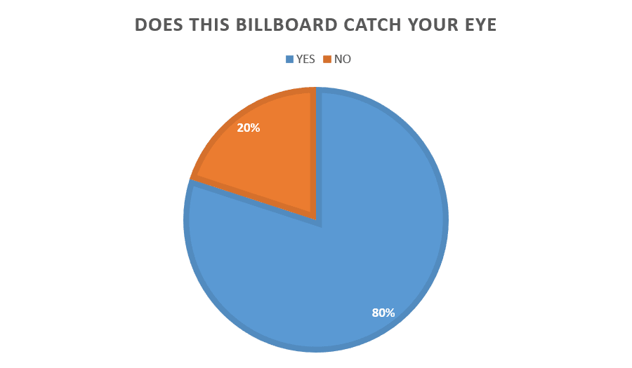
To gather more information about what my target audience think of my billboard I have asked the following three questions. I have presented the responses to these questions in a pie chart so that the information is clear and easy to translate.


I am very happy with the response to my billboard, these questions have shown that my design for my billboard in a front cover are very effective and that the majority of my target audience would buy my magazine after seeing the billboard. Also the majority of my target audience thought that my billboard was eye catching which is positive as well.