Showing posts with label My Magazine Double Page Spread. Show all posts

Sunday, 16 March 2014

My Double Page Spread Evaluation

My finished double page spread is based on the no make-up selfie for Cancer Research. I have chosen to do this article because it encourages girls to take off their makeup and feel self-empowered by showing off their natural beauty. I have used the left page for the writing and the right page for the images, this is because the reader’s natural eye direction when reading an article is left to right.

 I have based the layout of my double page spread on the codes and conventions of magazines double page spreads of the same genre I am following, also looking at other double page spreads gave my lots of ideas of how to set out my own, for example the insight into my article I saw in Vogue magazine and I really liked the look of it, therefore I used it in my own as I believe it will attract my target audiences attention.

With the images I have chosen to arrange them in this way because it means that I can get lots on the page as the more on the page the more it represents the amount of women who have taken a no makeup selfie. Originally I wanted to arrange them in the shape of a bow, one of the symbols for cancer research, however I believe this way of showing the images is much more powerful as you can see each one clearly and individually.
The title for my article I have used Century Gothic a text type that I have used a lot previously, I have highlight the text and changed it to capital letters. By using this font it would make my text continuous. I think that I am going to go with the Century Gothic text because I think it looks really modern which will appeal to my target audience and also the letters are thin which reflects what the title says.
The insight into my article is a vital part of my double page spread, my target audience will read this before they read the actual article, therefore this must be insightful, attention grabbing, and pleasant to read, if they do not like the sound of the insight then they will not continue to read the rest of the article. Therefore I have positioned it directly underneath the title. I have used Times New Roman italic font to continue that theme from my front cover and my contents page. I think it being in italic really complements the sharp straight edges of the Century Gothic in the title above it.


My Double Page Spread


This is my finished double page spread. I have chosen to put the writing on the left page and the images on the right because the reader’s eye direction goes from left to right.

The Layout of my Images

 
These are my chosen images for my double page spread, I have chosen to arrange them in this way because it means that I can get lots on the page as the more on the page the more it represents the amount of women who have taken a no makeup selfie. Originally I wanted to arrange them in the shape of a bow, one of the symbols for cancer research, however I believe this way of showing the images is much more powerful as you can see each one clearly and individually.

My Article

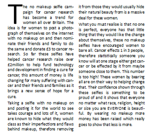
The no makeup selfie campaign for cancer research has become a trend for women all over Britain. The idea is for women to post a photograph of themselves on the internet with no makeup on and then nominate their friends and family to do the same and donate £3 to cancer research. So far these selfies have helped cancer research raise over £2million to help fund technology and development in finding a cure for cancer, this amount of money is life changing for many suffering with cancer and their friends and families as it brings a new sense of hope for a cure.

Taking a selfie with no makeup on and posting it for the world to see takes courage and lots of it, women are known to hide what they would class as their imperfections and flaws behind makeup, therefore removing it from those they would usually hide their natural beauty from is a massive deal for these women.
What you must realise is that no one is perfect, everyone has that little thing that they would like the change about themselves, these no makeup selfies have encouraged women to bare all. Cancer effects 1 in 3 people, therefore statistically someone you know will at one stage either get cancer or be effected by it from maybe someone close to them. This number is too high! These women by bearing all are on their way to helping change that. Their confidence shown through these selfies is something to be proud of and it shows that everyone no matter what race, religion, height or size you are EVERYONE is beautiful. By wearing no makeup more money has been raised which really goes to show that less is more.


My Article Content

The content for my article must be a good read for my target audience, therefore it must include relevant facts and persuade them that less is more when it comes to makeup. Girls don’t need to cake their faces in foundation, they should feel comfortable with what they look like, by posting a no makeup selfie they will embrace their natural beauty and show the world that they are not afraid to bare all. The way that models are portrayed in magazines with flawless skin, is the way teenage girls believe society expects them to look, they must understand that it is our flaws that define who we are and make everyone unique.

Saturday, 15 March 2014

The Insight into my Article

The insight into my article is a vital part of my double page spread, my target audience will read this before they read the actual article, therefore this must be insightful, attention grabbing, and pleasant to read, if they do not like the sound of the insight then they will not continue to read the rest of the article.

This is what the insight will say:
"The no makeup selfie campaign has taken the women of Britain by storm, posting bare faced photographs onto the internet, showing off their natural beauty usually hidden through layers of makeup for the world to see. Raising over £2million so far these women have given many that extra boost in confidence they need to do the same. If they can do it, so can you!"
I have done this in Times New Roman italic font to continue that theme from my front cover and my contents page. I think it being in italic really complements the sharp straight edges of the Century Gothic in the title above it.

Title Font

These are the options for my article title, I have decided to set them out with the Less is More in larger writing above You Are Who You Are because, is instantly catches the eye this way and makes the headline not look as long because my target audience are less likely to read a longer title.
For this example I have used Times New Roman font because I think it looks really professional and I like the way that the letters have finishing ends.


For this example I have used Century Gothic a text type that I have used a lot previously, I have highlight the text and changed it to capital letters. By using this font it would make my text continuous.
I think that I am going to go with the Century Gothic text because I think it looks really modern which will appeal to my target audience and also the letters are thin which reflects what the title says.

Article Title Ideas

These are some of my ideas for the article title of my double page spread

·         The no makeup selfie giving you that extra boost
·         The no makeup selfie campaign for cancer research
·         No makeup? No problem!
·         No makeup? You were born without it!
·         Who needs a paintbrush?
·         Who needs makeup? YOU DON’T!
·         No makeup the way to go
·         Makeup, who needs it? not us!
·         You don’t need makeup to be beautiful
·         Less is more, you are who you are
I really like the sound of the last one, “Less is more, you are who you are” I think if I separate it so less is more is above you are who you are, it might make it not look as long.

My Images

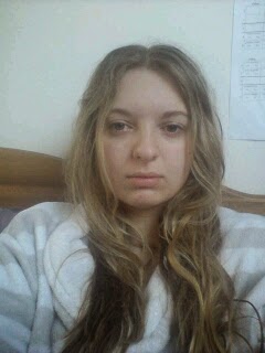
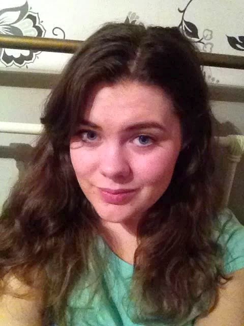
These are the images I intend to use in my double page spread


Now I will decide how to set them out, I believe using more than one image is the best option as it represents just how many thousands of people have done this for cancer research.


A Picture with Donation

Many women when posting a no makeup selfie will post it alongside an image of the text message that they send to cancer research once they have posted to donate their £3

 
This encourages others to do the same and also to remind them why they are posting. Although this is how it is portrayed on the internet I will not include this image in my final double page spread because I will be writing about why they are donating.

Template for my Double Page Spread


Planning my Double Page Spread

Following my research into double page spreads I am now ready to start planning my double page spread for my regional magazine. The article for my double page spread is going to be on the no makeup selfie campaign for cancer research. I believe that this is the best article out of my article research to do because women posting selfie’s on the internet of themselves with no makeup is a brilliant way to encourage teenagers that you do not have to cover your face in makeup to feel beautiful. The selfies have shown that every woman is beautiful and it takes a lot of confidence to do so. 

I intend for my double page spread to follow similar layouts to the double page spreads that I have analysed in my research. I will most likely follow my colour scheme through with black text on a white background, I will also put my writing into columns and so therefore I intend for my double page spread to look appealing, professional and eye catching.