Showing posts with label Audience Feedback. Show all posts

Monday, 17 March 2014

Audience Feedback - My Magazine

Now that I have finished my magazine I have asked 10 teenage girls between the ages of 13-17 for their feedback on my magazine, below are a list of comments that they have put forward.

“I love the concept of the magazine, I think that it is really inspiring and such a good idea to do a magazine on encouraging confidence in teenage girls, society forgets how vulnerable we really are and its encouraging for us to have a voice” – Sarah age 14
“I really like the layout of this magazine, I think it looks really professional. The front cover is really nice the way the colours go together and the fact that the model isn’t really wearing lots of makeup it is refreshing to see that on the front of a magazine” – Lola age 13
“The magazine looks really good, I’m happy to see a double page spread on such a good campaign, the article has really opened my eyes about wearing as much makeup as I do, and it has shown me that everyone is beautiful” - Marissa age 16
“The layout of the contents page is really good, the only thing I would change is adding a bit more colour to the text, maybe red to go with the colour of the girl’s top. It was nice to see a magazine encouraging girl’s confidence for a change” – Pippa age 17
“I like the fact that the front cover is not over crowded with information, it gives more attention to the articles being advertised. It is refreshing to see a front cover not airbrushed it really shows off the models natural beauty” - Lucy age 15
“The front cover and double page spread look really professional, the only thing that’s not as good is the contents page, it’s still really good but the text is too large in certain places. But I like the editors not at the bottom, it makes it feel more personal like she is talking to me directly” – Ellie age 13
“The front cover does look a bit bare, personally if it was me I would have the model a little further back with more room for text to be added, but it still looks good, if it was a real magazine I would definitely buy it” - Samantha age 17
“The double page spread is my favourite part, I love the way it is set out, it looks really professional, it is so nice to see girls without any makeup on in a magazine for a change, the contents page looks a little over crowded but it still looks good” – Jess age 14
“The pictures on the double page spread are nice but if they had been arranged differently they would be more effective, but the layout of the text is really good, I think it looks really professional and is a good idea of the theme of the magazine” – Kate age 13
“I really like this magazine, it looks professional full of the right content that is relevant to us as teenagers. The front cover is eye catching and I think by not having lots of text on there more attention is paid to the text that is on there, the contents page looks good, they only thing I would change is maybe having some different colour font, but the black works really well against the white, the double page spread is my favourite part, there is a reoccurring theme of black text and the message throughout the magazine that gives it that overall professional look, feel and effect. I would buy this magazine” – Amanda age 16
These comments on my magazine are reasonably good and positive, I’m glad my target audience have said they like the idea behind my magazine, the comments are also very similar when it comes to my contents page, for example a few have said maybe adding more colour, this is something I do agree with however I think the black works better and all the colour is therefore on the image getting more attention.
To look further into what my target audience think about my magazine I have asked the following 3 questions and put the responses into pie charts so that the feedback is clearly presented.


I am very happy with the responses given to my 3 questions, the answers show that the majority of my target audience asked would purchase this magazine and that it targets them directly, also that their favourite page was the double page spread, this is good because that is the main focus of the magazine as it is the part that will help them to boost their confidence.

Monday, 24 February 2014

Audience Feedback - My Radio Advertisement

Now that I have finished my radio advertisement I have asked 10 teenage girls between the ages of 13-17 for their feedback on my radio advertisement, below are a list of comments that they have put forward.

“I really like the way that this radio advert is done, I like that its someone using a personal story, it makes me want to buy the magazine more” – Sarah age 14
“Although it is poor quality the message given is one that people would instantly pay attention to, it’s a really good idea doing it this way” – Lola age 13
“By not having a jingle or music it makes the advert sound more serious, therefore gaining more attention from the audience” – Marissa age 16
“The advert sounds quite bland, some music or jingles would make it cheerier” – Pippa age 17
“This advert is really hard hitting, someone sharing personal story and how the magazine helped them through a difficult time is really uplifting to hear, it will encourage others in similar situations to purchase the magazine” – Lucy age 15
“The advert sounds good, I like how the speaks tone changes from sad to happy when talking about the magazine, it makes it more real” – Ellie age 13
“This radio advertisement is really effective in the way the speaker is telling a story, I’m glad that there isn’t any music because I think that that would ruin it” – Samantha age 17
“This advert is effective because it tells teenage girls that they are not alone when suffering from anxiety etc, I think this is a really good and positive topic to do because no one else has done it yet which makes it stand out from other radio adverts” – Jess age 14
“This is a good advert but I think it needs livening up a bit, some music would help with that, but still even without the music I think that this is a really good advert” – Kate age 13
“I think that this radio advert is a really good way of advertising the final product because it explains what the magazine can do for people therefore explaining why they should buy it, I think that the way it is told in a story is really effective as well because it lets others know they are not alone” – Amanda age 16
I am reasonably happy with the feedback from my target audience, they seemed to like my radio advertisement, a lot of people commented on how it was a good idea to tell the story of someone therefore my target audience can relate to it, this is exactly why I have don’t my advertisement this way and I am happy that my audience understood that, the only areas for improvement was to add some music or a jingle, however the reason that I never did this in  the first place was so that it didn’t distract away from the meaning and what was being said.
To gather more information about what my target audience think of my radio advertisement I have asked the following three questions. I have presented the responses to these questions in a pie chart so that the information is clear and easy to translate.


I am reasonably happy with the answers to these questions, they are positive as the majority have gone with the product being good as it is, 80% said they would by the magazine after hearing the advertisement which is exactly the purpose of why I have done a radio advertisement. Also the majority agreed that a jingle wouldn’t be best for the advertisement
 

Friday, 3 January 2014

Audience Feedback - My Billboard

Now that I have finished my billboard I have asked 10 teenage girls between the ages of 13-17 for their feedback on my billboard, below are a list of comments that they have put forward.

“I really like this billboard, I think it sums up the idea for the magazine perfectly! Very effective by doing it in the style of a front cover, I’ve never seen a billboard like this before therefore it has really caught my eye” – Sarah age 14
“Billboards always catch my eye, this one is really effective with the way it has been designed in the way of a front cover, there isn’t too much font either which means I got to take it all in in a short amount of time” – Lola age 13
“I’m not usually a fan of billboards but I think that this one is really good at portraying the product, I think the colours used are eye catching because they are fashionable at the moment, the black text really stands out which is good as well” – Marissa age 16
“The QR code at the bottom is such a good idea, it means I can get more information out of the billboard through my smartphone, it’s a really good idea to use other technology through the billboard as it keeps us hooked on the information” – Pippa age 17
“The billboard looks good, but the text is all at the bottom, it should be spread out a bit more to cover the billboard, but I like the use of the quote as it has made me want to buy the magazine and find out more about it” – Lucy age 15
“The quote on the billboard is such a good idea, it really catches my eye and I know that so many other teenagers can relate to confidence issues so this is a really good way of advertising, I like the ways its set out as a front cover as well” – Ellie age 13
“Setting it out as a front cover is a really good and different way of advertising, I haven’t seen others like it which means it’s unique, like the title! I would definitely buy this magazine” – Samantha age 17
“I’m not a massive fan of the idea of it being set out as a front cover, I think it can come across as too pushy for us to buy the magazine, but I can understand why it is like this, that’s just my personal opinion” – Jess age 14
“The billboard looks really professional, the only think I would change is the colour of the text, although it stands out against the background, I think if parts of it were in different colours then that would be more eye catching” – Kate age 13
“This billboard looks really good, I like the ways that it has been designed as a front cover, it means when we go to buy it we know exactly what to look for, I think the black texts looks good as well as it stands up and adding the quote has made it clear what the magazine is going to be about, therefore it has selected its target audience” – Amanda age 16
I am really happy with the feedback from my target audience on my billboard, the majority of the comments are positive which goes to show I was right to design it the way that I did, a few said about the text just being black and I should add more colour to it, but I have designed it this way so that it stands out and contrasts against the dark background so I will leave it as it is.
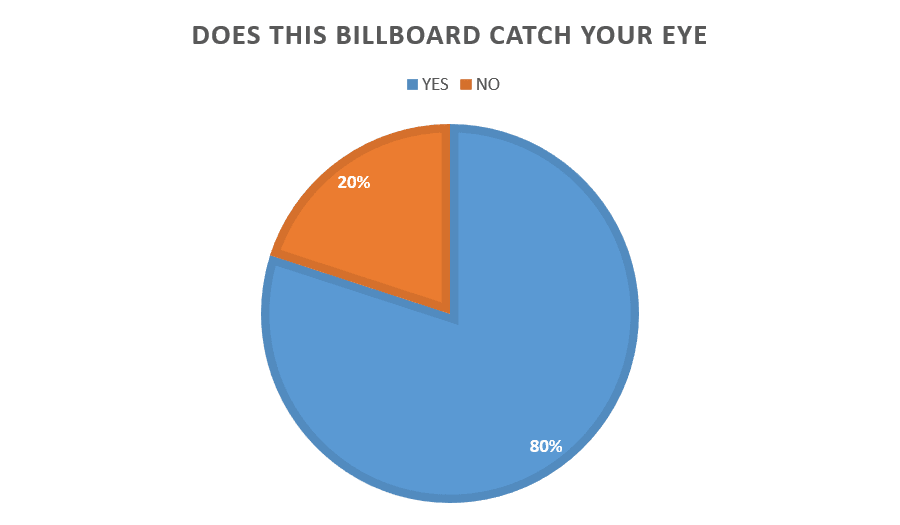
To gather more information about what my target audience think of my billboard I have asked the following three questions. I have presented the responses to these questions in a pie chart so that the information is clear and easy to translate.


I am very happy with the response to my billboard, these questions have shown that my design for my billboard in a front cover are very effective and that the majority of my target audience would buy my magazine after seeing the billboard. Also the majority of my target audience thought that my billboard was eye catching which is positive as well.