“I really like this
billboard, I think it sums up the idea for the magazine perfectly! Very effective
by doing it in the style of a front cover, I’ve never seen a billboard like
this before therefore it has really caught my eye” – Sarah age 14
“Billboards always
catch my eye, this one is really effective with the way it has been designed in
the way of a front cover, there isn’t too much font either which means I got to
take it all in in a short amount of time” – Lola age 13
“I’m not usually a fan
of billboards but I think that this one is really good at portraying the
product, I think the colours used are eye catching because they are fashionable
at the moment, the black text really stands out which is good as well” –
Marissa age 16
“The QR code at the
bottom is such a good idea, it means I can get more information out of the
billboard through my smartphone, it’s a really good idea to use other
technology through the billboard as it keeps us hooked on the information” –
Pippa age 17
“The billboard looks
good, but the text is all at the bottom, it should be spread out a bit more to
cover the billboard, but I like the use of the quote as it has made me want to
buy the magazine and find out more about it” – Lucy age 15
“The quote on the
billboard is such a good idea, it really catches my eye and I know that so many
other teenagers can relate to confidence issues so this is a really good way of
advertising, I like the ways its set out as a front cover as well” – Ellie age
13
“Setting it out as a
front cover is a really good and different way of advertising, I haven’t seen
others like it which means it’s unique, like the title! I would definitely buy
this magazine” – Samantha age 17
“I’m not a massive fan
of the idea of it being set out as a front cover, I think it can come across as
too pushy for us to buy the magazine, but I can understand why it is like this,
that’s just my personal opinion” – Jess age 14
“The billboard looks
really professional, the only think I would change is the colour of the text,
although it stands out against the background, I think if parts of it were in
different colours then that would be more eye catching” – Kate age 13
“This billboard looks
really good, I like the ways that it has been designed as a front cover, it
means when we go to buy it we know exactly what to look for, I think the black
texts looks good as well as it stands up and adding the quote has made it clear
what the magazine is going to be about, therefore it has selected its target audience”
– Amanda age 16
I am really happy with the feedback from my target audience on
my billboard, the majority of the comments are positive which goes to show I was
right to design it the way that I did, a few said about the text just being
black and I should add more colour to it, but I have designed it this way so
that it stands out and contrasts against the dark background so I will leave it
as it is.
To gather more information about what my target audience think
of my billboard I have asked the following three questions. I have presented
the responses to these questions in a pie chart so that the information is
clear and easy to translate.

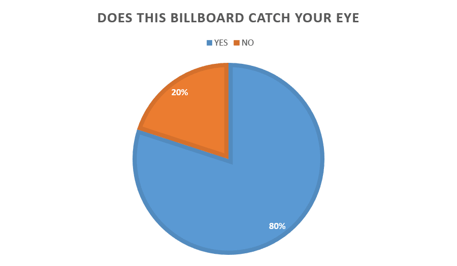

I am very happy with the response to my billboard, these
questions have shown that my design for my billboard in a front cover are very
effective and that the majority of my target audience would buy my magazine
after seeing the billboard. Also the majority of my target audience thought
that my billboard was eye catching which is positive as well.
No comments:
Post a Comment