Monday 31 March 2014

My Performance Throughout The Coursework

Throughout this task I have struggled to use the technology of blogger, however now that I have finished I believe that I have done better than I originally thought I would. I got off to quite a slow start as you can see from the dates of my blog posts, only posting 28 in 2013, but then after Christmas I believed I found my footing with the technology and magazine to get my overall amount of blog posts up to 111 for 2014. This I am very proud of.

If I was to do anything differently I would have changed the way I went about my tasks, I put a lot more effort into the billboard ancillary task than I should have, forgetting it was only worth 10 marks. I did not put the same amount of effort into my other ancillary my radio advertisement due to lack of time for completing the tasks. Therefore if I was to do anything differently I would have spent more time on my magazine research and planning than I did on my ancillary task.
Overall I am extremely pleased with my finished tasks, research, and evaluations, especially with the house style which matches the ethos of my magazine, and is evident in all of my tasks.

My Evaluations


After completing each task I have evaluated them, I have written about the final products appearance, and also difficulties making them. I have done this so that my products have been analysed to the extent that the every aspects of my final products have been taken into account. I have also written short pieces on my research so that I will be able to look back at them whilst designing my final piece.

My four evaluations questions,
• In what ways does your media product use, develop or challenge forms and conventions of real media products?
• How effective is the combination of your main product and ancillary texts?
• What have you learned from your audience feedback?
• How did you use media technologies in the construction and research, planning and evaluation stages?
Each question was to be answered using four different media technologies, however due to lack of equipment I could only use three, video, Prezi and PowerPoint. I have chosen these three technologies because I believe these are the best ways to present my information. My video was again of poor quality as I did not have access to professional equipment, therefore I again had to use the web cam on my laptop.
 

Sunday 30 March 2014

How effective is the combination of your main product and ancillary texts?


How effective is the combination of your main product and ancillary texts? Speech

For my evaluation question how effective is the combination of your main product and ancillary texts? I will present it on a video, this is the speech that I will use.

“Hello my name is Grace Hards Candidate number 2253. In this video I will be answering the evaluation question, how effective is the combination of your main product and ancillary texts?
The combination of my main product my regional magazine, and my ancillary tasks my billboard and my radio advertisement, are very effective as a combination. All three final products link together really well through my ongoing theme of raising teenage girl’s self-confidence through my regional magazine.
My billboard is designed in the style of the front cover of my magazine, I have designed this product this way so that there is continuity throughout my products and therefore it is instantly recognisable to my target audience of teenage girls. The image and masthead used on my billboard are the same that are used on the front cover of my regional magazine. This masthead is then carried through to appear on my contents page and a small version appears in my double page spread above the page number.
The message portrayed on my billboard is that “happiness and confidence is a girl’s best accessory” as the purpose of my magazine is to raise confidence in my target audience, the message given on my billboard is a brief insight to my magazine also explaining this idea of raising confidence.
My radio advertisement tells the story of a young girl called jenny, she suffers with anxiety and doesn’t like to leave her house because of the way that she looks, therefore she has no confidence, however when her mum bought her teen unique magazine, she found her confidence and is now going to a party with her friends. Therefore the message given through this radio advertisement is that after reading teen unique magazine she gained more confidence, which is the overall purpose of my magazine.
Therefore the message of gaining confidence through my regional magazine is given through both my billboard and my radio advertisement overall making the combination between my ancillary tasks and my final product very effective.”

Monday 17 March 2014

Audience Feedback - My Magazine

Now that I have finished my magazine I have asked 10 teenage girls between the ages of 13-17 for their feedback on my magazine, below are a list of comments that they have put forward.

“I love the concept of the magazine, I think that it is really inspiring and such a good idea to do a magazine on encouraging confidence in teenage girls, society forgets how vulnerable we really are and its encouraging for us to have a voice” – Sarah age 14
“I really like the layout of this magazine, I think it looks really professional. The front cover is really nice the way the colours go together and the fact that the model isn’t really wearing lots of makeup it is refreshing to see that on the front of a magazine” – Lola age 13
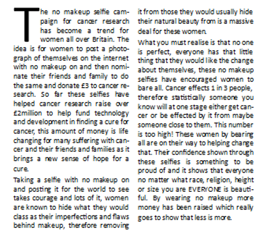
“The magazine looks really good, I’m happy to see a double page spread on such a good campaign, the article has really opened my eyes about wearing as much makeup as I do, and it has shown me that everyone is beautiful” - Marissa age 16
“The layout of the contents page is really good, the only thing I would change is adding a bit more colour to the text, maybe red to go with the colour of the girl’s top. It was nice to see a magazine encouraging girl’s confidence for a change” – Pippa age 17
“I like the fact that the front cover is not over crowded with information, it gives more attention to the articles being advertised. It is refreshing to see a front cover not airbrushed it really shows off the models natural beauty” - Lucy age 15
“The front cover and double page spread look really professional, the only thing that’s not as good is the contents page, it’s still really good but the text is too large in certain places. But I like the editors not at the bottom, it makes it feel more personal like she is talking to me directly” – Ellie age 13
“The front cover does look a bit bare, personally if it was me I would have the model a little further back with more room for text to be added, but it still looks good, if it was a real magazine I would definitely buy it” - Samantha age 17
“The double page spread is my favourite part, I love the way it is set out, it looks really professional, it is so nice to see girls without any makeup on in a magazine for a change, the contents page looks a little over crowded but it still looks good” – Jess age 14
“The pictures on the double page spread are nice but if they had been arranged differently they would be more effective, but the layout of the text is really good, I think it looks really professional and is a good idea of the theme of the magazine” – Kate age 13
“I really like this magazine, it looks professional full of the right content that is relevant to us as teenagers. The front cover is eye catching and I think by not having lots of text on there more attention is paid to the text that is on there, the contents page looks good, they only thing I would change is maybe having some different colour font, but the black works really well against the white, the double page spread is my favourite part, there is a reoccurring theme of black text and the message throughout the magazine that gives it that overall professional look, feel and effect. I would buy this magazine” – Amanda age 16
These comments on my magazine are reasonably good and positive, I’m glad my target audience have said they like the idea behind my magazine, the comments are also very similar when it comes to my contents page, for example a few have said maybe adding more colour, this is something I do agree with however I think the black works better and all the colour is therefore on the image getting more attention.
To look further into what my target audience think about my magazine I have asked the following 3 questions and put the responses into pie charts so that the feedback is clearly presented.


I am very happy with the responses given to my 3 questions, the answers show that the majority of my target audience asked would purchase this magazine and that it targets them directly, also that their favourite page was the double page spread, this is good because that is the main focus of the magazine as it is the part that will help them to boost their confidence.

Sunday 16 March 2014

My Double Page Spread Evaluation

My finished double page spread is based on the no make-up selfie for Cancer Research. I have chosen to do this article because it encourages girls to take off their makeup and feel self-empowered by showing off their natural beauty. I have used the left page for the writing and the right page for the images, this is because the reader’s natural eye direction when reading an article is left to right.

 I have based the layout of my double page spread on the codes and conventions of magazines double page spreads of the same genre I am following, also looking at other double page spreads gave my lots of ideas of how to set out my own, for example the insight into my article I saw in Vogue magazine and I really liked the look of it, therefore I used it in my own as I believe it will attract my target audiences attention.

With the images I have chosen to arrange them in this way because it means that I can get lots on the page as the more on the page the more it represents the amount of women who have taken a no makeup selfie. Originally I wanted to arrange them in the shape of a bow, one of the symbols for cancer research, however I believe this way of showing the images is much more powerful as you can see each one clearly and individually.
The title for my article I have used Century Gothic a text type that I have used a lot previously, I have highlight the text and changed it to capital letters. By using this font it would make my text continuous. I think that I am going to go with the Century Gothic text because I think it looks really modern which will appeal to my target audience and also the letters are thin which reflects what the title says.
The insight into my article is a vital part of my double page spread, my target audience will read this before they read the actual article, therefore this must be insightful, attention grabbing, and pleasant to read, if they do not like the sound of the insight then they will not continue to read the rest of the article. Therefore I have positioned it directly underneath the title. I have used Times New Roman italic font to continue that theme from my front cover and my contents page. I think it being in italic really complements the sharp straight edges of the Century Gothic in the title above it.


My Double Page Spread


This is my finished double page spread. I have chosen to put the writing on the left page and the images on the right because the reader’s eye direction goes from left to right.

The Layout of my Images

 
These are my chosen images for my double page spread, I have chosen to arrange them in this way because it means that I can get lots on the page as the more on the page the more it represents the amount of women who have taken a no makeup selfie. Originally I wanted to arrange them in the shape of a bow, one of the symbols for cancer research, however I believe this way of showing the images is much more powerful as you can see each one clearly and individually.

My Article

The no makeup selfie campaign for cancer research has become a trend for women all over Britain. The idea is for women to post a photograph of themselves on the internet with no makeup on and then nominate their friends and family to do the same and donate £3 to cancer research. So far these selfies have helped cancer research raise over £2million to help fund technology and development in finding a cure for cancer, this amount of money is life changing for many suffering with cancer and their friends and families as it brings a new sense of hope for a cure.

Taking a selfie with no makeup on and posting it for the world to see takes courage and lots of it, women are known to hide what they would class as their imperfections and flaws behind makeup, therefore removing it from those they would usually hide their natural beauty from is a massive deal for these women.
What you must realise is that no one is perfect, everyone has that little thing that they would like the change about themselves, these no makeup selfies have encouraged women to bare all. Cancer effects 1 in 3 people, therefore statistically someone you know will at one stage either get cancer or be effected by it from maybe someone close to them. This number is too high! These women by bearing all are on their way to helping change that. Their confidence shown through these selfies is something to be proud of and it shows that everyone no matter what race, religion, height or size you are EVERYONE is beautiful. By wearing no makeup more money has been raised which really goes to show that less is more.


My Article Content

The content for my article must be a good read for my target audience, therefore it must include relevant facts and persuade them that less is more when it comes to makeup. Girls don’t need to cake their faces in foundation, they should feel comfortable with what they look like, by posting a no makeup selfie they will embrace their natural beauty and show the world that they are not afraid to bare all. The way that models are portrayed in magazines with flawless skin, is the way teenage girls believe society expects them to look, they must understand that it is our flaws that define who we are and make everyone unique.

Saturday 15 March 2014

The Insight into my Article

The insight into my article is a vital part of my double page spread, my target audience will read this before they read the actual article, therefore this must be insightful, attention grabbing, and pleasant to read, if they do not like the sound of the insight then they will not continue to read the rest of the article.

This is what the insight will say:
"The no makeup selfie campaign has taken the women of Britain by storm, posting bare faced photographs onto the internet, showing off their natural beauty usually hidden through layers of makeup for the world to see. Raising over £2million so far these women have given many that extra boost in confidence they need to do the same. If they can do it, so can you!"
I have done this in Times New Roman italic font to continue that theme from my front cover and my contents page. I think it being in italic really complements the sharp straight edges of the Century Gothic in the title above it.

Title Font

These are the options for my article title, I have decided to set them out with the Less is More in larger writing above You Are Who You Are because, is instantly catches the eye this way and makes the headline not look as long because my target audience are less likely to read a longer title.
For this example I have used Times New Roman font because I think it looks really professional and I like the way that the letters have finishing ends.


For this example I have used Century Gothic a text type that I have used a lot previously, I have highlight the text and changed it to capital letters. By using this font it would make my text continuous.
I think that I am going to go with the Century Gothic text because I think it looks really modern which will appeal to my target audience and also the letters are thin which reflects what the title says.

Article Title Ideas

These are some of my ideas for the article title of my double page spread

·         The no makeup selfie giving you that extra boost
·         The no makeup selfie campaign for cancer research
·         No makeup? No problem!
·         No makeup? You were born without it!
·         Who needs a paintbrush?
·         Who needs makeup? YOU DON’T!
·         No makeup the way to go
·         Makeup, who needs it? not us!
·         You don’t need makeup to be beautiful
·         Less is more, you are who you are
I really like the sound of the last one, “Less is more, you are who you are” I think if I separate it so less is more is above you are who you are, it might make it not look as long.

My Images

These are the images I intend to use in my double page spread


Now I will decide how to set them out, I believe using more than one image is the best option as it represents just how many thousands of people have done this for cancer research.


A Picture with Donation

Many women when posting a no makeup selfie will post it alongside an image of the text message that they send to cancer research once they have posted to donate their £3

 
This encourages others to do the same and also to remind them why they are posting. Although this is how it is portrayed on the internet I will not include this image in my final double page spread because I will be writing about why they are donating.

Template for my Double Page Spread


Planning my Double Page Spread

Following my research into double page spreads I am now ready to start planning my double page spread for my regional magazine. The article for my double page spread is going to be on the no makeup selfie campaign for cancer research. I believe that this is the best article out of my article research to do because women posting selfie’s on the internet of themselves with no makeup is a brilliant way to encourage teenagers that you do not have to cover your face in makeup to feel beautiful. The selfies have shown that every woman is beautiful and it takes a lot of confidence to do so. 

I intend for my double page spread to follow similar layouts to the double page spreads that I have analysed in my research. I will most likely follow my colour scheme through with black text on a white background, I will also put my writing into columns and so therefore I intend for my double page spread to look appealing, professional and eye catching.

Friday 14 March 2014

Choosing my Article for my Double Page Spread

After researching different ideas for articles for my double page spread, I think I am going to choose the no makeup selfie, this is because I think that it is the perfect way of presenting the idea to teenage girls that they should feel happy and comfortable in their own skin. For my article I will use the facts about the campaign and will also take lots of photographs of my friends with no makeup on in the style of a selfie to make the images for the article look authentic.

Callie Thorpe and Danielle Vanier


Callie Thorpe and Danielle Vanier are both fashion bloggers for plus size girls, recently they have looked at the plus size range for high street store New Look. With New Look offering a wider range of clothes than ever before for this size selection it gives larger girls the opportunity to go into a high street store and not have to hunt for something that fits, doing an article on this for my magazine allows plus size girls the chance to feel as valued in the high street stores as everyone else. Also New Look is an affordable store for all which is perfect for my target audience.

Monday 10 March 2014

My Contents Page Evaluation

My finished contents page continues from my front cover with the white background. The black Century Gothic font is also continued and the title of the magazine is in the same format as it is on the front cover, with The Confidence Issue underneath in Times New Roman Italic which is the same as Unique in Teen Unique.

To decide what image I should use on my contents page I asked 10 teenage girls between the ages of 13-17, the photo that I ended up using got the highest amount of votes so I used that one. I decided to ask my target audience because I couldn’t decide between the three, and as they are the ones viewing it, there opinion is essential.
I have decided to set my contents page out following the same conventions as a magazine contents page of the genre I am following. I have separated on the cover articles and featured articles using headings. When writing my pages references I have followed on from my front cover using black Century Gothic font; the page numbers however are Bell Gothic Std Light, this is so they stand out against the writing. The titles for the articles are in font size 26 and the insights are size 20.5 italic, this is so it is clear what is where.
In the bottom left of the page I have included a note from the editor (myself) that reads, “This month we are working on building up your confidence, we hope this issue gives you that extra boost you need to feel comfortable in your own skin. Remember it’s what is on the inside that counts.” By doing this I intend for my target audience to feel more connected to the magazine by feeling the note addresses them individually.

Sunday 9 March 2014

My Contents Page

 
This is my finished contents page. I have chosen to use an image from my no makeup selfie article from my double page spread instead of one to do with my front cover, this is so it grabs attention and makes the audience want to read the double page spread.

The Font and Layout for my Page References

 
This is what my page numbers and sections will look like on the contents page. I have followed on from my front cover using black Century Gothic font; the page numbers however are Bell Gothic Std Light, this is so they stand out against the writing. The titles for the articles are in font size 25 and the insights are size 20.5 italic, this is so it is clear what is where.

The Top of my Contents Page


This is going to be the top of my contents page. I have chosen to do it this way through my research of analysing other contents pages, I have included the name of my magazine, what the issue is going to be about, and the date of the issue. This gives my audience all of the relevant information. I am actually quite impressed with this as I believe it looks quite professional.

Final Image Decision

I could not decide on the photo graph to use to ask 10 teenage girls to choose which one they thought would be best.


Selfie number 1 scored the highest with 40% and the other two both equally scored 30% therefore I will go with the majority and use selfie number 1 for the image on my contents page. This image is of my friend Amanda, she is wearing a bright red top which is eye catching and she is looking directly into the camera enhancing her natural beauty.

Note From The Editor

In most of the magazines I have analysed on the contents page there was usually a note from the editor, I believe this is a great way for my target audience to feel more connected to the magazine by feeling as though they are being addressed personally, therefore I will include a short but sweet one in my contents page which will say the following.

This month we are working on building up your confidence, we hope this issue gives you that extra boost you need to feel comfortable in your own skin. Remember it’s what is on the inside that counts.


Saturday 8 March 2014

Images for my Contents Page

As I am doing my double page spread on the no makeup selfie campaign for cancer research I have taken photographs of my friends and family to make them look like average selfies they would have taken themselves. I have taken 16 photographs that I intend to use on my double page spread however I have narrowed it down to 3 photographs to use on my contents page.


Template for my Contents Page


Planning my Contents Page

Following my researching into magazine contents pages I am now ready to start planning my contents page for my regional magazine. The contents page is essential to any magazine as it shows the readers where in the magazine articles they wish to read are located, therefore my contents page must be clear, easy to read and follow, and should be in chronological order.
The contents pages I have analysed have shown the columns of page numbers broken up into sections, for example the cover stories in one part and the features in another, my contents page will follow the same idea and layout. I will also have an image on the page with the writing next to it. 

Friday 7 March 2014

Magazine Research Evaluation

My research into magazines has given me a clear idea of what my own magazine should include and how to design it. Firstly I looked into the history of magazines, this way I was able to look at the progression of magazines over time and establish how mine should follow in pursuit of other magazines of the genre I am following by going on to then look at the typical fashion and beauty magazine.

I spent a lot of time researching models and eating disorders being portrayed in magazines and the use of Photoshop because the use of skinny models in magazines caused teens to believe that society expects them to look this way, and that is why I have decided for the theme of my magazine to go against this idea and help girls feel comfortable in their own skin.
I went on to look at the typography, colour schemes and layouts of magazines to help me prepare for my own magazine.
I decided to research front covers, contents pages, and double page spreads, separately because then more attention could be paid to them. Through my research of these I analysed 3 difference examples of each to give myself a clear idea of what was expected when it came to the layout and design of my own magazine.

What I Have Found Out Through My Contents Page Research

Through my contents page research I have found out that the title of my magazine should still be located at the top of the page with the date and issue number, possibly with the title of contents next to it so that it is clear to my readers what the page will consist of.

Through analysing other contents pages of the same genre of magazine, I think that there should be separate sections of contents, for example on the cover in one section, with other article in another section, and possibly the main article having a completely separate part of the page either near or as part of an image. There should be an image on my contents page also, possibly linked to my main article so that it is clear for my readers to find it.
When it comes to font on my contents page, the page numbers should be larger than the title of the articles and the title of the articles should be larger than the insight to the article. The colour scheme should be consistent throughout my magazine from the front cover to the contents page to the double page spread, and this should be the same when it comes to the font being consistent also.
Now I believe I am ready to start planning the contents page for my regional magazine.

Thursday 6 March 2014

InStyle Magazine Contents Page Analysis


Above is an analysis I have conducted of InStyle magazine contents page. By doing this I am able to see what other magazines of the genre I am following have done, to ensure my contents page reaches its best potential.
The title of the magazine with the title of the page is located at the top of the page with the issue number and date underneath giving the readers relevant information also following the usual conventions of a contents page layout. It has two different colours and types of font, making a clear difference between the two, also standing out against the background.
The page numbers are in bold with the article title in larger font compared to the insight into the article showing a clear difference between the two and making the title of the article more eye catching. The burgundy and black colour theme is continued throughout the page including the title, the text and even the models outfit that all complement each other and contrast against the white background.
The image of the model covers a considerable amount of the page and is most likely featured on the front cover and is what the main article is about; the main story is given its own section for page reference which shows importance and allows the readers the opportunity to turn straight to that page without having to look through the page listings to find it. This is something that has occurred throughout my analysis of contents pages and is something I intend to include in my contents page.

Tuesday 4 March 2014

Vogue Magazine Contents Page Analysis


Above is an analysis I have conducted of Vogue magazine contents page. By doing this I am able to see what other magazines of the genre I am following have done to ensure my contents page reaches its best potential.
The title of the magazine Vogue and an issue date is located at the top of the page which identifies the magazine, with the option to subscribe at the bottom right corner of the page separated from the rest drawing attention to it, overall gives the readers relevant information. The title is in black font with important sub headings in red which is continual throughout.
The title of each article is in italic with the insight to the article underneath it in normal font, which cerate’s a clear difference between the two and makes the title of the article stand out. The page numbers are situated to the left of the titles and are slightly larger than the writing again making them stand out. The columns of page numbers are separated by category, fashion, special features and cover stories, this creates a clear balance between them.
The column of cover stories is placed on top of the image of the model with white writing to contrast against the dark background making it clear and readable. Also because of where it is situated completely away from the other stories, it makes it look more important.
I like the idea of the image covering the majority of the page, I think I will use this idea when designing my cover page. Also with the page numbers slightly larger than the text I think I will use an idea similar to this also.

Monday 3 March 2014

Glamour Magazine Contents Page Analysis


Above is an analysis I have conducted of Glamour magazines contents page. By doing this I am able to see what other magazines of the genre I am following have done to ensure my contents page reaches its best potential.
The title of the magazine with a web address and issue date are situated at the top of the page which creates continuity throughout the magazine, also the web address gives the audience relevant information on the magazine. The colours of the title are in three different type, green orange and light blue, all of the colours complement each other nicely and stand out against the white background.

The image located to the right of the page covers a considerable amount of the page and is instantly eye catching, this image is most likely of the same model that is on the front cover and is most likely featured in the main article. Also the page number to this story is separated from the rest with it being on top of the image gives the impression that this is the main article.

The name of the issue, The Style Issue, highlights what the rest of the magazine is going to be about, with the pink wording of style continuing onto the page numbers of article associated with style. The font on the contents page labelling the articles is continuous throughout, with the main feature in bold text and an insight as to what it is about in standard normal sizing. Finally the on the cover part of the contents page is separated from the articles about style, giving it more attention, the title for this section is in green following the title at the top of the page.

I really like the way that the colour scheme continues throughout this page, I also really like the layout of the page with the image of the model covering a considerable amount, therefore giving the readers what they want.

Sunday 2 March 2014

Locating the articles

The simplest way to number a contents page is to simple do it 1 2 3, bullet points are pointless because the reader will not be able to tell where the articles are, and not everyone can translate roman numerals. Always make sure that a contents page is in chronological order, this way the readers will be able to find out what they are looking for quickly and efficiently without causing confusion, which will result in frustration and they may no longer wish to read the magazine. Also make it clear where they can find articles that were advertised on the front cover, that may have been the reason that they purchased the magazine and you don’t want to disappoint your readers.

Saturday 1 March 2014

The Purpose of a Contents Page

The purpose of a contents page is to give the reader an idea of other stories/ information within the magazine and what page numbers you can find it on. It also needs to be easy to read and follow. The colour scheme of the contents page is usually similar if not the same to the front cover.  A content page is laid out differently to a front cover as it needs to be readable and contain more specific information than the front cover has.

Monday 24 February 2014

Audience Feedback - My Radio Advertisement

Now that I have finished my radio advertisement I have asked 10 teenage girls between the ages of 13-17 for their feedback on my radio advertisement, below are a list of comments that they have put forward.

“I really like the way that this radio advert is done, I like that its someone using a personal story, it makes me want to buy the magazine more” – Sarah age 14
“Although it is poor quality the message given is one that people would instantly pay attention to, it’s a really good idea doing it this way” – Lola age 13
“By not having a jingle or music it makes the advert sound more serious, therefore gaining more attention from the audience” – Marissa age 16
“The advert sounds quite bland, some music or jingles would make it cheerier” – Pippa age 17
“This advert is really hard hitting, someone sharing personal story and how the magazine helped them through a difficult time is really uplifting to hear, it will encourage others in similar situations to purchase the magazine” – Lucy age 15
“The advert sounds good, I like how the speaks tone changes from sad to happy when talking about the magazine, it makes it more real” – Ellie age 13
“This radio advertisement is really effective in the way the speaker is telling a story, I’m glad that there isn’t any music because I think that that would ruin it” – Samantha age 17
“This advert is effective because it tells teenage girls that they are not alone when suffering from anxiety etc, I think this is a really good and positive topic to do because no one else has done it yet which makes it stand out from other radio adverts” – Jess age 14
“This is a good advert but I think it needs livening up a bit, some music would help with that, but still even without the music I think that this is a really good advert” – Kate age 13
“I think that this radio advert is a really good way of advertising the final product because it explains what the magazine can do for people therefore explaining why they should buy it, I think that the way it is told in a story is really effective as well because it lets others know they are not alone” – Amanda age 16
I am reasonably happy with the feedback from my target audience, they seemed to like my radio advertisement, a lot of people commented on how it was a good idea to tell the story of someone therefore my target audience can relate to it, this is exactly why I have don’t my advertisement this way and I am happy that my audience understood that, the only areas for improvement was to add some music or a jingle, however the reason that I never did this in  the first place was so that it didn’t distract away from the meaning and what was being said.
To gather more information about what my target audience think of my radio advertisement I have asked the following three questions. I have presented the responses to these questions in a pie chart so that the information is clear and easy to translate.


I am reasonably happy with the answers to these questions, they are positive as the majority have gone with the product being good as it is, 80% said they would by the magazine after hearing the advertisement which is exactly the purpose of why I have done a radio advertisement. Also the majority agreed that a jingle wouldn’t be best for the advertisement
 

Sunday 23 February 2014

My Radio Advertisement Evaluation

My finished radio advertisement turned out to be 35 seconds long, a little longer than I hoped for, and the quality is very poor because I had no access to equipment so it had to be recorded by placing my thumb over the webcam and recording it on my laptop.

However the message given I was very happy with. I decided to tell the story of a young girl named Jenny, who is 17 years old suffering from anxiety who read Teen Unique magazine and it gave her that confidence boost that she needed. This way I think my target audience will be able to relate to the situation also through the use of a female voice, and therefore be more inclined to purchase my final product. The tone of voice from the speaker also changes from a sad tone when talking about her anxiety, to a happier tone when talking about the magazine, therefore encouraging the audience to buy this as the change in tone reflects her change on confidence.
In my advertisement I have managed to explain what the purpose of the magazine is, why people should buy it, and when it is available for purchase, the only thing that I forgot to include was the price.
Through my radio advertising research I discovered all of the things that I should and shouldn’t include, which really helped me when planning my advertisement, from listening the More! Magazine radio advertisement it gave me the idea of having one speaker throughout my advertisement.
I hope through my radio advertisement I have captured the true purpose behind my magazine, reinstalling confidence in those who need it.

Saturday 22 February 2014

My Radio Advertisement


This is my finalised radio advertisement, unfortunately it is poor quality due to lack of equipment it had to be recorded on my laptop so the sound is not perfect. However I am happy with the message it gives.

Thursday 20 February 2014

Third and Final Draft for my Radio Advertisement

“Hello I’m Jenny, I’m 17 years old and suffer from anxiety. It started off gradually I suppose, I’m a little larger than the rest of my friends, and I hated going out because I hated the way that I looked and eventually became dependant on staying indoors. Then my mum bought my Teen Unique magazine, it taught me all about being comfortable in my own skin and being happy by accepting who I am, so now I’m going to a party with my friends next weekend and I can’t wait! Slowly but surely I’m gaining my confidence back thanks to Teen Unique Magazine.
 Teen unique available March 20th in all major retailers and off licences.”

This is the third and final draft of the speech for my radio advertisement. The length is 33seconds.

Second Draft for my Radio Advertisement

“Hello I’m Jenny, I’m 17 years old and suffer from anxiety. It started off gradually I suppose, I’m a little larger than the rest of my friends,  and I hated going out in large groups of people, where I knew I was going to bump into someone, I hated the way that I looked and eventually became dependant on staying indoors. Then my mum bought my Teen Unique magazine, it taught me all about being comfortable in my own skin and being happy by accepting who I am, so now I’m going to a party with my friends next weekend and I can’t wait! Slowly but surely I’m gaining my confidence back thanks to Teen Unique. Teen unique available March 20th in all major retailers and off licences.”

This is the second draft of the speech for my radio advertisement. The length is 34 seconds.

First Draft for my Radio Advertisement

“Hello my name is jenny, I’m 17 years old and suffer with anxiety. At first I didn’t realise what was going on, it started gradually, I’m a little larger than the rest of my friends, hated going out in large groups of people, to somewhere where I knew I was going to bump into someone I knew, I hated the way that I looked and eventually became dependant on staying indoors. Then my mum bought my Teen Unique magazine, it taught me all about being comfortable in my own skin and being happy by accepting who I am, so now I’m going to a party with my friends next weekend and I can’t wait! Slowly but surely I’m gaining my confidence back thanks to Teen Unique.
Teen unique out March 20th, available in all major retailers and off licences.”

This is the first draft of the speech for my radio advertisement. The length is 41 seconds.

Wednesday 19 February 2014

Bethany Hamilton

Bethany Hamilton has become a source of inspiration to millions through her story of faith, determination, and hope. Born into a family of surfers on February 8, 1990, on the island of Kauai, Hawaii, Bethany began surfing at a young age. At the age of eight, Bethany entered her first surf competition, where she won both the short and long board divisions. This sparked a love for surf competition within her spirit. At the age of thirteen, on October 31, 2003, Bethany was attacked by a 14-foot tiger shark while surfing off Kauai’s North Shore. The attack left Bethany with a severed left arm. After losing over 60% of her blood, and making it through several surgeries without infection, Bethany was on her way to recovery with an unbelievably positive attitude. Lifeguards and doctors believe her strong water sense and faith in God helped get her through the traumatic ordeal.


Miraculously, just one month after the attack, Bethany returned to the water to continue pursuing her goal to become a professional surfer. In January of 2004, Bethany made her return to surf competition; placing 5th in the Open Women’s division of that contest. With no intention of stopping, Bethany continued to enter and excel in competition. Just over a year after the attack she took 1st place in the Explorer Women’s division of the 2005 NSSA National Championships – winning her first National Title. In 2007, Bethany realized her dream and turned pro. Bethany has since participated in numerous ASP and World Tour Events with a major highlight being a second place finish in the ASP 2009 World Junior Championships.
Since losing her arm, Bethany’s story has been told in hundreds of media outlets and she has been recognized with numerous awards, public appearances, and various speaking engagements. In October 2004, Bethany shared her life story in her autobiography entitled Soul Surfer. Seven years later, the book was made into a film bearing the same title which released in 2011. Further, Bethany was the inspiration behind Becky Baumgartner’s 2007 documentary entitled Heart of a Soul Surfer.
Out of the water, Bethany has grown from a young teenage girl with aspirations of becoming a professional surfer into a twenty-three-year old professional surfer with aspirations of becoming a beacon of inspiration and hope. Through the platform of professional sport, Bethany has been able to touch a large number of people with her message, charitable efforts, and overall spirit. Bethany is involved in numerous charitable efforts, including her own foundation, Friends of Bethany, which supports shark attack survivors, amputees, and serves to inspire others through her life story.
Bethany is a true inspiration for girls with disabilities, the determination and struggle has bought confidence to girls with similar disabilities and reinstate the thought that you can achieve whatever you set your mind to. This is the same genre of reinstating confidence that I want to portray in my magazine.
 

The Use of a Celebrity Voice

By using the voice of a female celebrity will automatically grab attention for my radio advert and with their involvement with the magazine will encourage my target audience to buy it. They could perhaps speaking of an experience that they have gone through that is relatable to my target audience such as:

·         Lack of confidence
·         An eating disorder
·         Low self-esteem
·         Anxiety
·         Depression
Then they could go on to talk about how they have overcome this experience, and how they wished that they had a magazine similar to this to help them get through and let them know that they are not alone.
However I do not know a celebrity so perhaps a soothing calming female voice instead.